
TRIGGERFLEX · SYSTEM BREAKDOWN
The Flex Library,
laid out to point at.
Every motion in the TriggerFlex kit, one per panel, running live. Each panel names the Flex, describes what it does, and lists exactly what it needs to build — so you can say “Flex Hero with Mouse Trails up top, Snap Showcase for the work” and we both mean the same thing.
FLEX 03 · NAME what we call it
description what it does, in plain words
ASSETS / MOTION / HOOKS what it needs to build
scroll ↓
01
FLEX 01 · BLUR-IN REVEAL
The Workhorse Reveal
Every element fades up from soft-blur as it enters view. Cascading delays across siblings make it read as choreographed, not decorated. This is used ~25× on a real page — it is the house default for anything appearing on scroll.
Craft, revealed in sequence.
01Identity
02Editorial
03Motion
04Packaging
Scroll back up and down — each element blurs in from opacity 0 + blur(16px), on a cascading delay.
AssetsNone. Works on any text, image, or block.
Motionopacity 0→1, blur(16px)→0, 60px rise, power2.out, 0.6s
Hooks
data-ui-animate + data-direction / data-delay / data-offset / data-durationBest forHeadlines, cards, list items, section intros — the connective tissue of the whole page.
Watch outCascade the delays (0.0 / 0.15 / 0.30…). Same delay on every child kills the effect.
02
FLEX 02 · PARALLAX DEPTH
Layered Scroll Parallax
Elements travel at different speeds as you scroll, so the composition gains depth. The cheapest possible ‘designed’ feel — one attribute per layer, powered by ScrollSmoother’s effects engine.
Depth
AssetsAny images/backgrounds you want layered. 2–4 layers reads best; one image per layer.
MotionPer-element scroll speed via
data-speed (<1 lags, >1 leads); optional data-lagHooks
data-speed="0.6–1.2" on any element inside #smooth-contentBest forHero backgrounds, image bands, big display type sitting between fore/back layers.
Watch outRequires ScrollSmoother
effects:true. Keep speed deltas subtle — big gaps feel gimmicky.03
FLEX 03 · MOUSE TRAILS v1
Cursor Image Trail
Move the cursor across the stage and a stream of images spawns in its wake, cycling through the set and fading out behind you. A hover-driven hero delight — desktop only.
Assets14 images in the current set (g01–g14). Any count works; 10–16 is the sweet spot. Roughly square, ~600–800px, interchangeable.
MotionCursor lerp-tracked; every ~80px of movement spawns the next image, z-index cycling
Hooks
.content > .content__img > .content__img-inner[data-background]; auto-inits on the first .contentBest forA signature hero, an intro splash, a portfolio landing moment.
Watch outOne per page (binds to the first
.content). Hidden on mobile (d-none d-md-block) — give touch users a static fallback.04
FLEX 04 · SNAP SHOWCASE
Pinned Snap Slider
The panel pins and, as you scroll, wipes through full-bleed slides that snap into place — thumbnails and captions track in sync. The vertical portfolio centerpiece; this is ‘controlled cinema’.

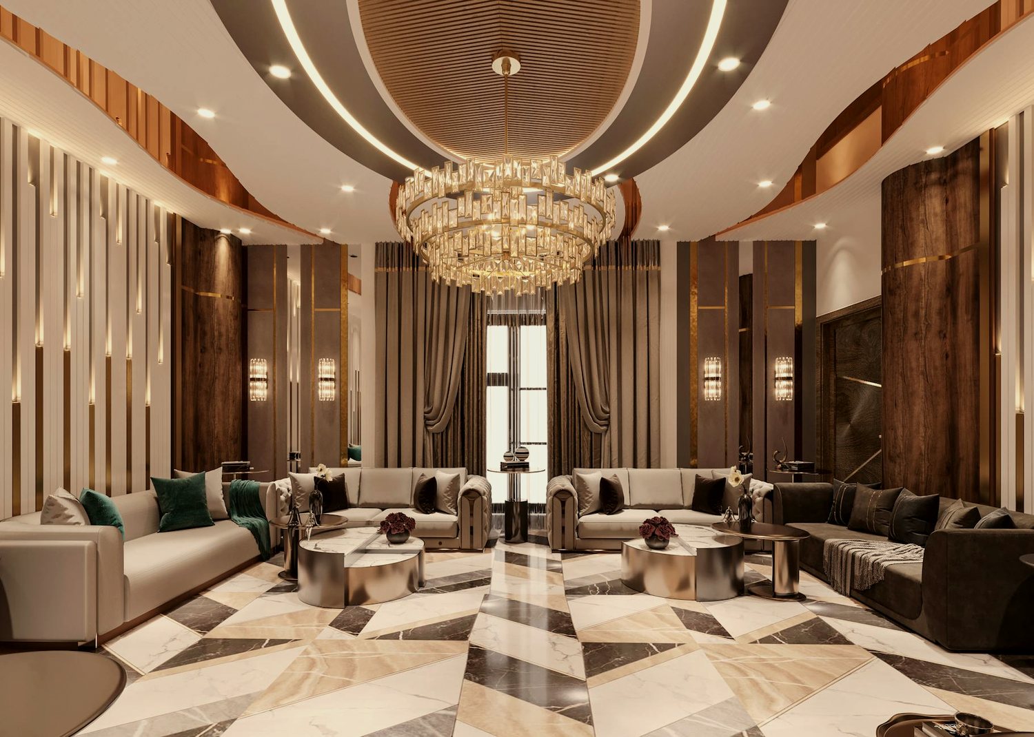
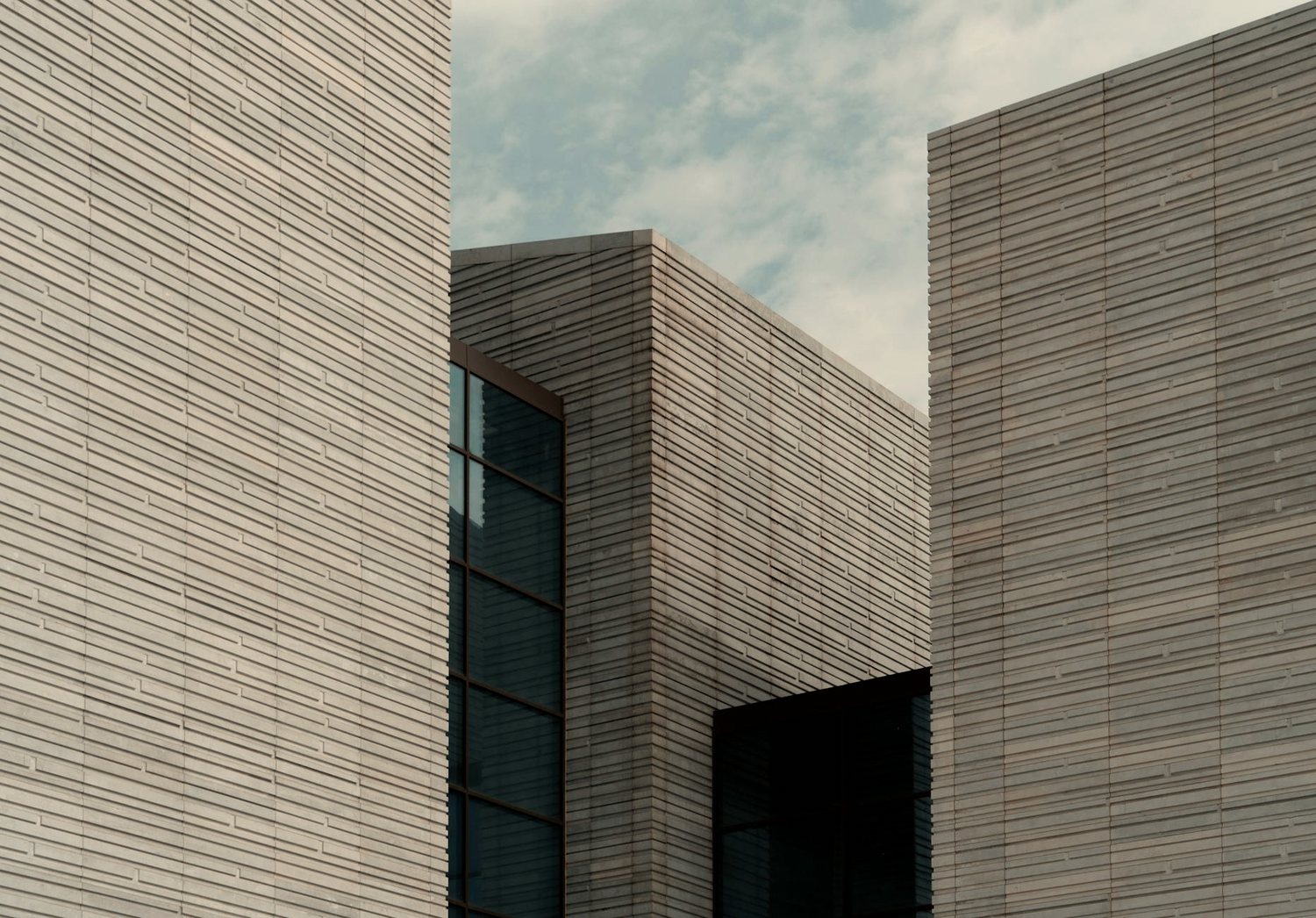



AssetsPer slide: 1 full-bleed hero image (large, ~1600px) + 1 thumbnail + a title + up to 3 tag links. Current build = 4 slides.
MotionSection pins; masked images translate ±100vh for a wipe; ScrollTrigger snap between slides
Hooks
.ui-snap-slider → .snap-slide .main-img + .snap-slider-thumbs .thumb-slideBest forShowcasing 4–6 flagship projects with weight and rhythm.
Watch outConsumes ~3 screens of scroll while pinned. Budget the page length; use it once.
05
FLEX 05 · STACK CARDS
Pinned Scale-Stack
Cards pin and scale down slightly as the next card scrolls up over them, building a physical ‘deck’ feel. Reads as testimonials or featured items with hierarchy.

Carol Buyers
Ceo Founder
“Working with was an outstanding experience. Their ability to understand our vision and translate it into a clean, functional design exceeded our expectations. We received incredible feedback on the new website.”

Jane Cooper
Creative Director
“Working with was an outstanding experience. Their ability to understand our vision and translate it into a clean, functional design exceeded our expectations. We received incredible feedback on the new website.”

Carol Buyers
Ceo Founder
“Working with was an outstanding experience. Their ability to understand our vision and translate it into a clean, functional design exceeded our expectations. We received incredible feedback on the new website.”
Assets1 portrait image per card + name / role / quote (and an optional logo slot). Current = 3 cards.
MotionEach card pins and scales to
1 - (count - index) × 0.025 as the next arrivesHooks
.stackCard (all instances collected globally)Best forTestimonials, awards, a short curated set that deserves a beat each.
Watch outDesktop only (gated >991px). The logo/badge slot is a swap point — drop the placeholder badge.
06
FLEX 06 · FADE-TITLE
Pinned Fading Title
A section title pins, scales up and dissolves on scrub as the content beneath scrolls past. Gives a section a deliberate, cinematic transition.
We build the
one-of-one.
The title above pins in place, scales up to 1.3× and fades to nothing as this block scrolls past it — a cinematic hand-off between sections.
Reserve it for the one or two moments in a page that earn a pause.
AssetsNone. One display headline.
MotionTitle pins;
scale 1→1.3, opacity 1→0, linear, scrubbed to scrollHooks
.fix-title-sec .sec-head-crevBest forA chapter break, a manifesto line, the transition into a showcase.
Watch outOne per page. Needs enough content after it to scrub against.
07
FLEX 07 · THROWABLES
Physics Throwable Bin
When it scrolls into view, a set of chips rains into a bin under real gravity — and you can grab and fling them with the mouse. A playful, tactile signature for a services or skills section.
SEO/Marketing
Motion

UI/UX Design

Branding
Assets6–10 items; each a short label chip OR a small image/logo. Current = 6 text chips.
MotionMatter.js scene; gravity 0.8; IntersectionObserver triggers the rain; mouse constraint lets visitors throw
Hooks
[data-tp-throwable-scene] → [data-tp-throwable-el] childrenBest forServices, skills, tech-stack, tags — anywhere a list can become a toy.
Watch outLoads Matter.js. Keep item count sane (≤12). Give it a fixed-height bin so items don’t escape.
08
FLEX 08 · MAGNETIC + CURSOR
Cursor & Magnetic Buttons
A custom cursor dot trails the mouse; buttons magnetically pull toward it on hover; links roll their letters over. The small touches that quietly signal ‘expensive’.
AssetsNone.
MotionCursor lerps to mouse;
.hover-this translates up to 25px toward pointer; .rolling-text letters roll on hoverHooks
.cursor (global) + .hover-this .hover-anim + .rolling-textBest forPrimary CTAs, nav links, anything you want to feel responsive and alive.
Watch outPointer devices only. Don’t magnetise everything — reserve for CTAs.
09
FLEX 09 · GRID-MORPH
Flip Gallery (separate page)
A grid of tiles reflows into an entirely new composition as you scroll, using GSAP Flip to animate between two layouts. Documented here, not run live — it requires the Lenis scroller, which cannot share a page with ScrollSmoother.
State A — grid
→
State B — composition
Live demo runs on its own page: portfolio-parallax.html / scrollbased.
AssetsA set of 8–12 image tiles that read well in both a grid and a scattered composition.
Motion
Flip.getState between two layout classes, animated on scrub + pin; inner images scale 2→1Hooks
.gallery ↔ .gallery--switch (Lenis + Flip)Best forA dedicated portfolio or gallery page that wants one showstopper reflow.
Watch out⚠ Runs on Lenis — give it its OWN page. Do not combine with a ScrollSmoother page like this one.